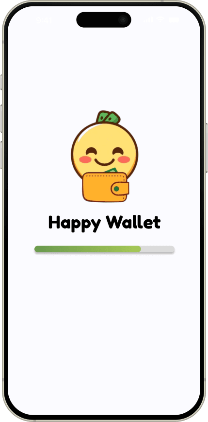
Happy Wallet
Financial Literacy for College Students
Role:
Designer
Time:
Oct - Dec 2024
Team:
Patricia English, Kristen Chung, Kiera Fong,
Maiella Nuqui, Heidi Tran, Kalia Miyasaki
Context
Design Project Teams is a quarter-long program at UC Irvine where interdisciplinary student teams create a solution around a central design theme. For our quarter, the prompt was "caring for yourself, others, or the world." Our team chose to focus on financial literacy for college students, aiming to empower them with tools and knowledge to manage their finances confidently and sustainably.
The Challenge
"How might we help college students who struggle to understand and prioritize financial goals gain the knowledge and confidence to manage their finances effectively?"
Research
To ensure our design aligned with real user needs, we surveyed 67 participants and conducted 8 interviews to identify pain points and gaps in the current landscape of financial education tools.
Surveys
Our survey consisted of questions regarding how users would rank their financial literacy and if they wanted to boost their financial literacy. Most students showed a strong desire to learn more about managing money but lacked the confidence and tools to begin.
We found that:
84%
Do not feel financially literate
76%
Want to increase their financial literacy
" transform="translate(5 5)" width="75px"/><path d="M 0 0 L 0 22.5 L 15 30" fill="transparent" height="30px" id="k44QYh0S4" stroke-dasharray="" stroke-linecap="round" stroke-linejoin="round" stroke-width="9.46036" stroke="rgb(0, 255, 151)" transform="translate(42.5 20)" width="15px"/></svg>)
Competitive Analysis
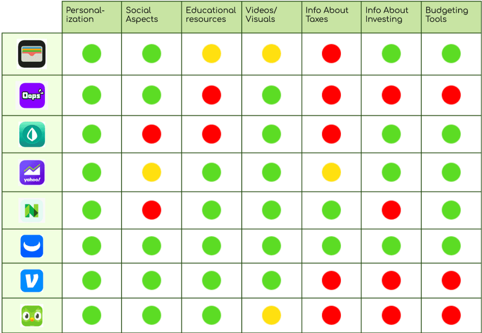
We researched 12 education and finance apps, focusing on features like incentives and educational resources. We noticed that many apps did not include financial topics that our survey participants were interested in, so we made a point to include them in our app.
" transform="translate(6 6)" width="70px"/><path d="M 0 0 L 30 0" fill="transparent" height="1px" id="lRUX81rMO" stroke-dasharray="" stroke-linecap="round" stroke-linejoin="miter" stroke-miterlimit="10" stroke-width="10.1361" stroke="rgb(0, 255, 151)" transform="translate(26 26)" width="30px"/><path d="M 0 0 L 62.5 0" fill="transparent" height="1px" id="IPCM8ukvX" stroke-dasharray="" stroke-linecap="round" stroke-linejoin="miter" stroke-miterlimit="10" stroke-width="10.1361" stroke="rgb(0, 255, 151)" transform="translate(13.5 66)" width="62.5px"/><path d="M 0 0 L 62.5 0" fill="transparent" height="1px" id="XDUUGzszS" stroke-dasharray="" stroke-linecap="round" stroke-linejoin="miter" stroke-miterlimit="10" stroke-width="10.1361" stroke="rgb(0, 255, 151)" transform="translate(13.5 81)" width="62.5px"/><path d="M 0 0 L 62.5 0" fill="transparent" height="1px" id="aqyQiiDGK" stroke-dasharray="" stroke-linecap="round" stroke-linejoin="miter" stroke-miterlimit="10" stroke-width="10.1361" stroke="rgb(0, 255, 151)" transform="translate(13.5 96)" width="62.5px"/><path d="M 7.5 15 C 2.5 15 0 11.642 0 7.5 C 0 3.358 2.5 0 7.5 0" fill="transparent" height="15px" id="QI0Le539u" stroke-dasharray="" stroke-linecap="round" stroke-linejoin="round" stroke-width="10.1361" stroke="rgb(0, 255, 151)" transform="translate(6 66)" width="7.5px"/><path d="M 7.5 15 C 2.5 15 0 11.642 0 7.5 C 0 3.358 2.5 0 7.5 0" fill="transparent" height="15px" id="t1dQcsoSr" stroke-dasharray="" stroke-linecap="round" stroke-linejoin="round" stroke-width="10.1361" stroke="rgb(0, 255, 151)" transform="translate(6 81)" width="7.5px"/></svg>)
" height="84.99957500000001px" id="iReBqVOYr" width="84.99995832169603px"/></svg>)
Interviews
We were able to conduct 8 interviews and gained qualitative insights into users' frustrations.
We found that:
Lack of Time
Overly Technical
Incentivization
Users prefer bite-sized information & short form content to save time
Users want to learn content on their own rather than compete with others, so we focused on self-learning over competition
We want to avoid overly complicated and jargon-heavy vocabulary
“I think that learning about finances is not something that you need to be ranked on. I think it should be done at your own pace and not in competition with others.”
-Interviewee #3
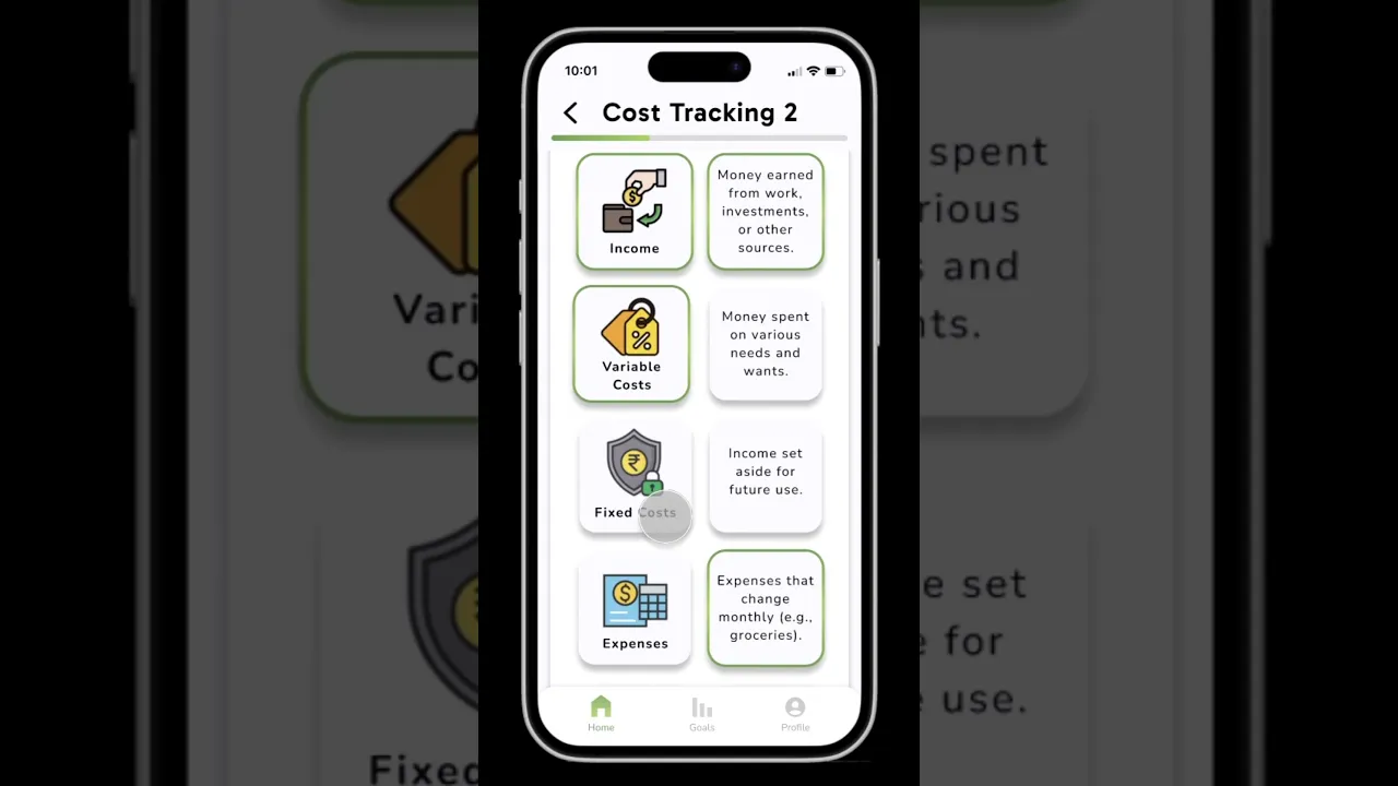
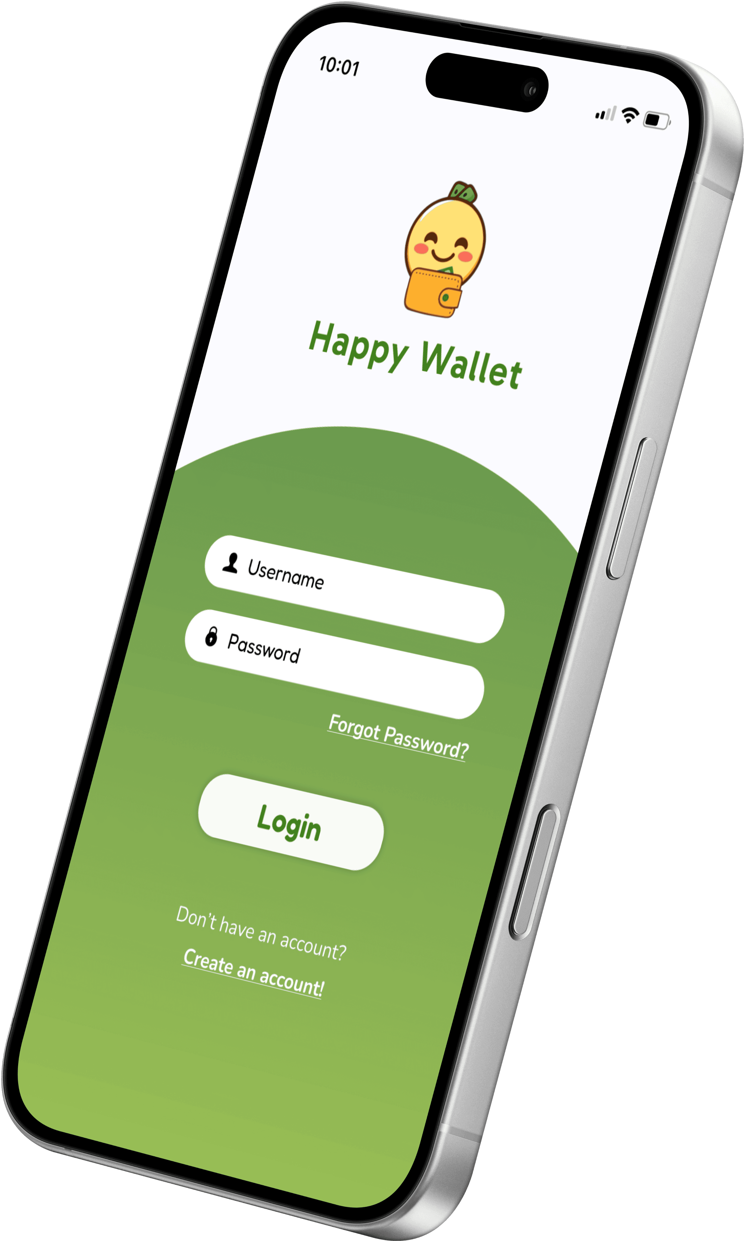
Our Solution
To address these needs, we created Happy Wallet, a mobile app that delivers personalized courses tailored to individual financial goals and preferred learning styles. Instead of gamification, the app uses a calm, professional tone and breaks down complex concepts into simple, goal-oriented lessons.
Design Process
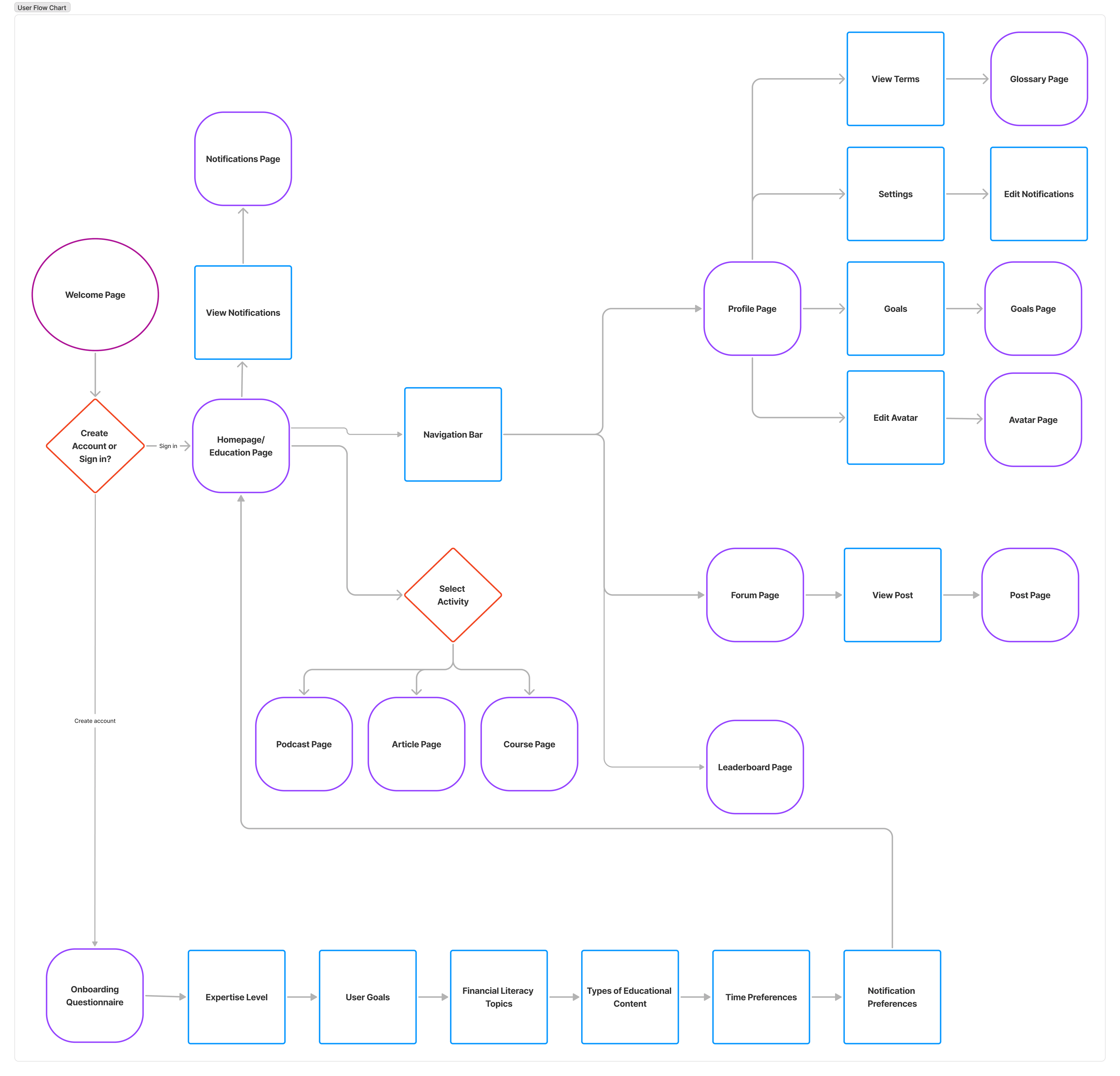
User Flow
Our initial user flow that was created after the research process that included a forum page to make/view posts from other users.
After further analyzing our research and findings from our surveys and interviews, we decided to scrap the forum idea since users did not seem too keen on interacting with others when it came to financial literacy.

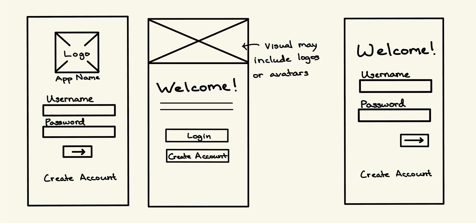
Sketches
Our team divided the necessary pages among ourselves and began sketching designs based on group discussions, incorporating features we wanted to include and any ideas we had for the pages.
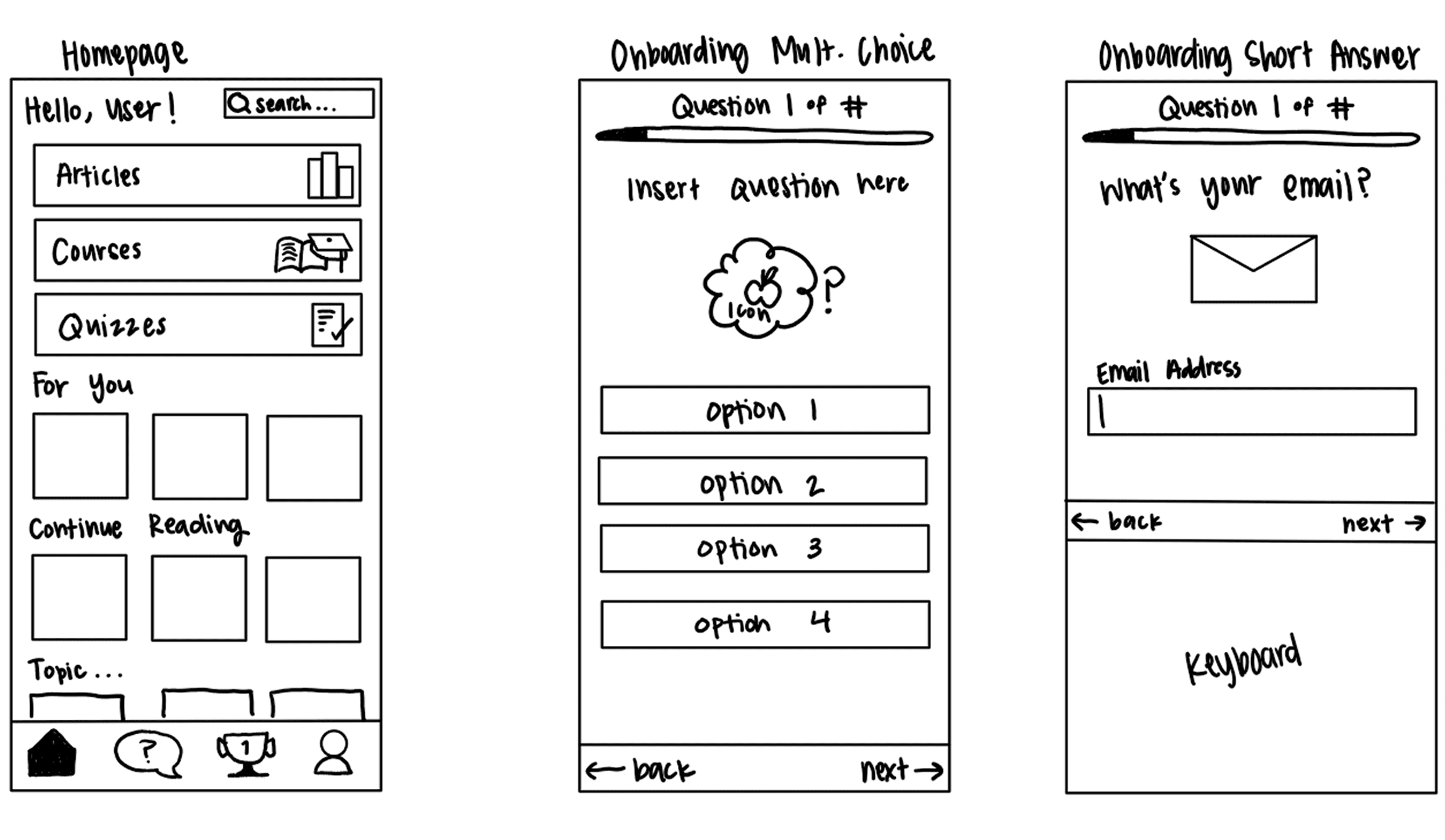


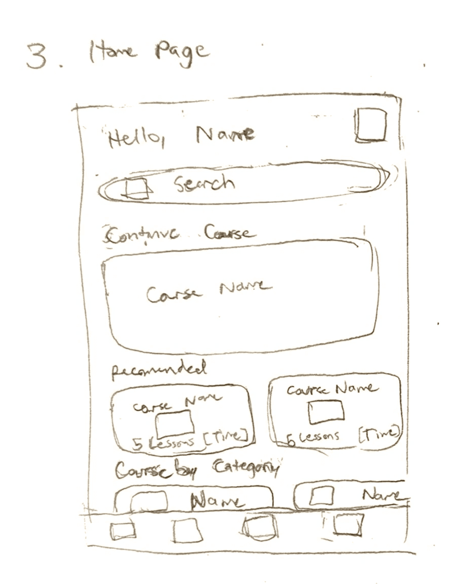
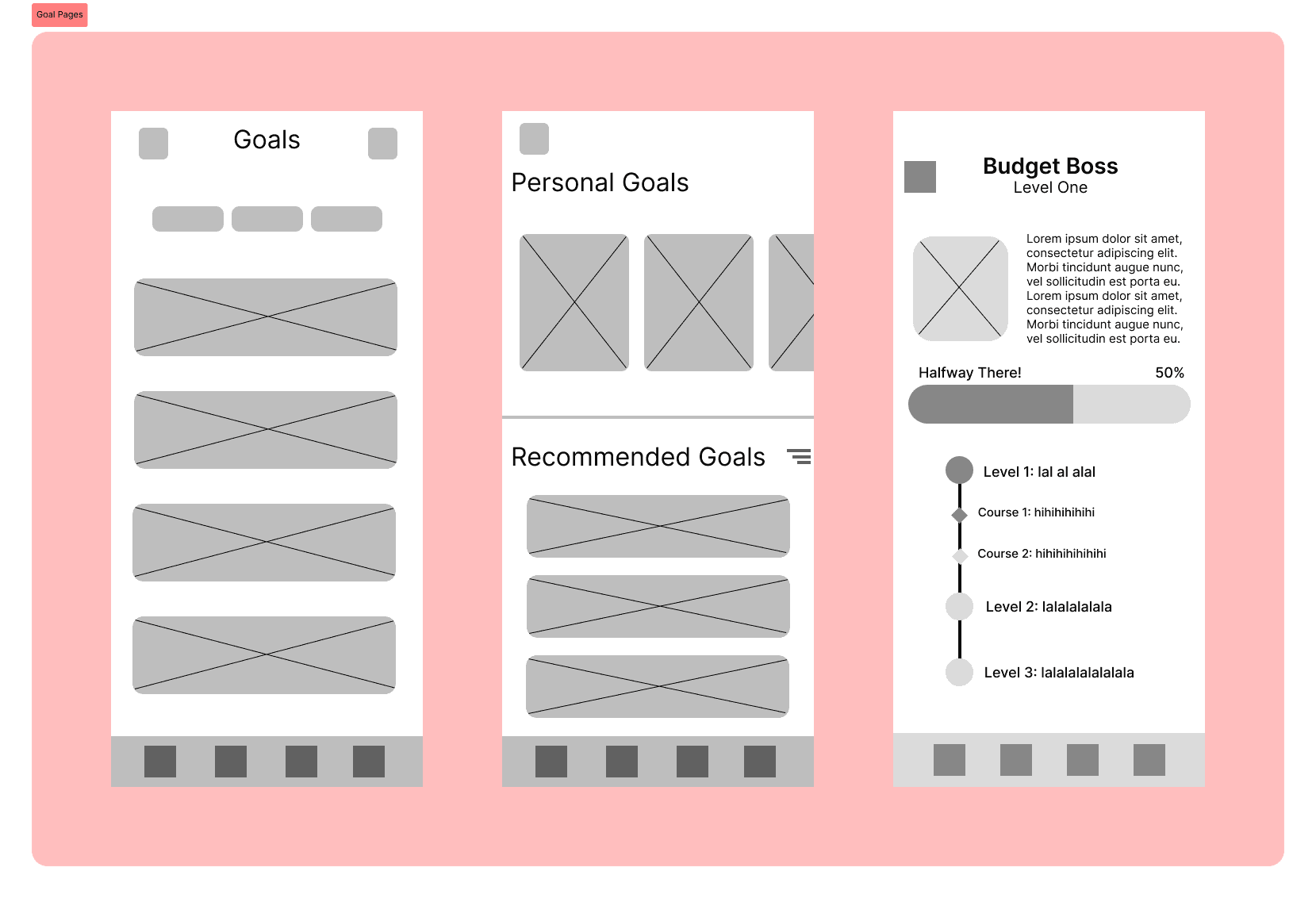
Lo-Fi Wireframes
This led us to low fidelity wireframing, where we transformed our sketches into basic wireframes. This step was essential in helping us plan out the structure and layout of our app, and many of us made several versions of the same page to explore different layouts and determine which best aligned with the goal we aimed to accomplish.


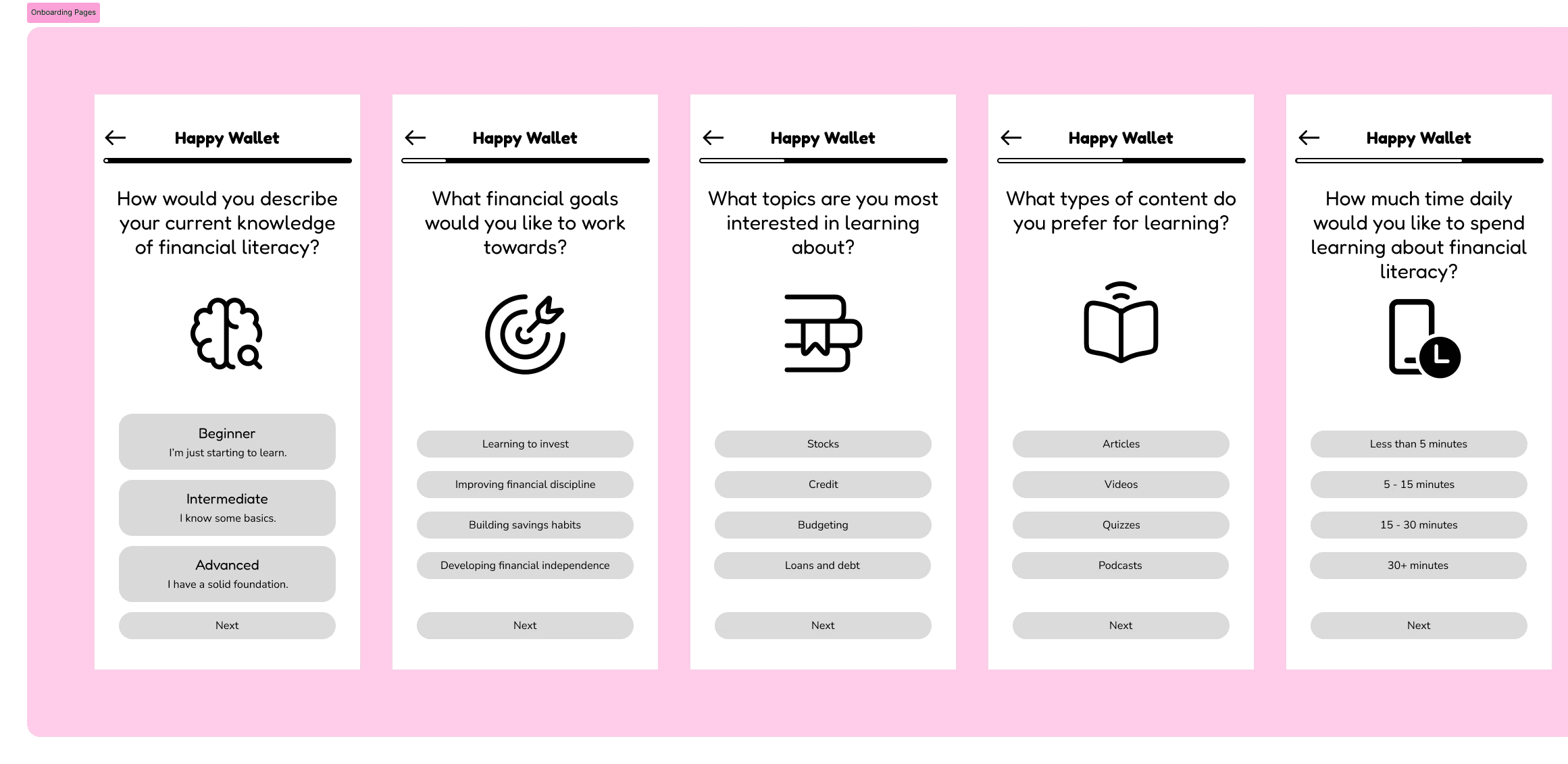
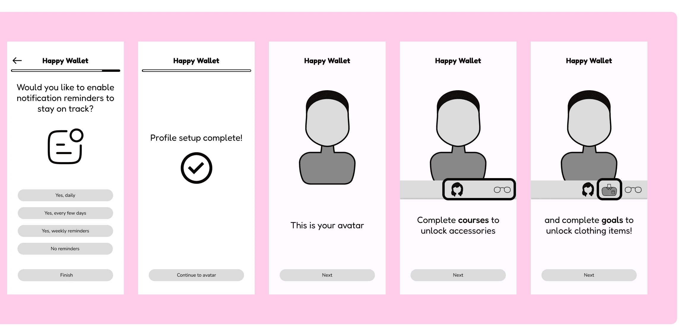
Mid-Fi Wireframes
During our mid-fi wireframing process, we established the project's visual style by carefully selecting fonts and iconography that align with our design goals. We refined the pages by focusing on and finalizing the layout to enhance user flow and clarity. By prioritizing both aesthetics and functionality, we created a strong foundation for the next steps in development.
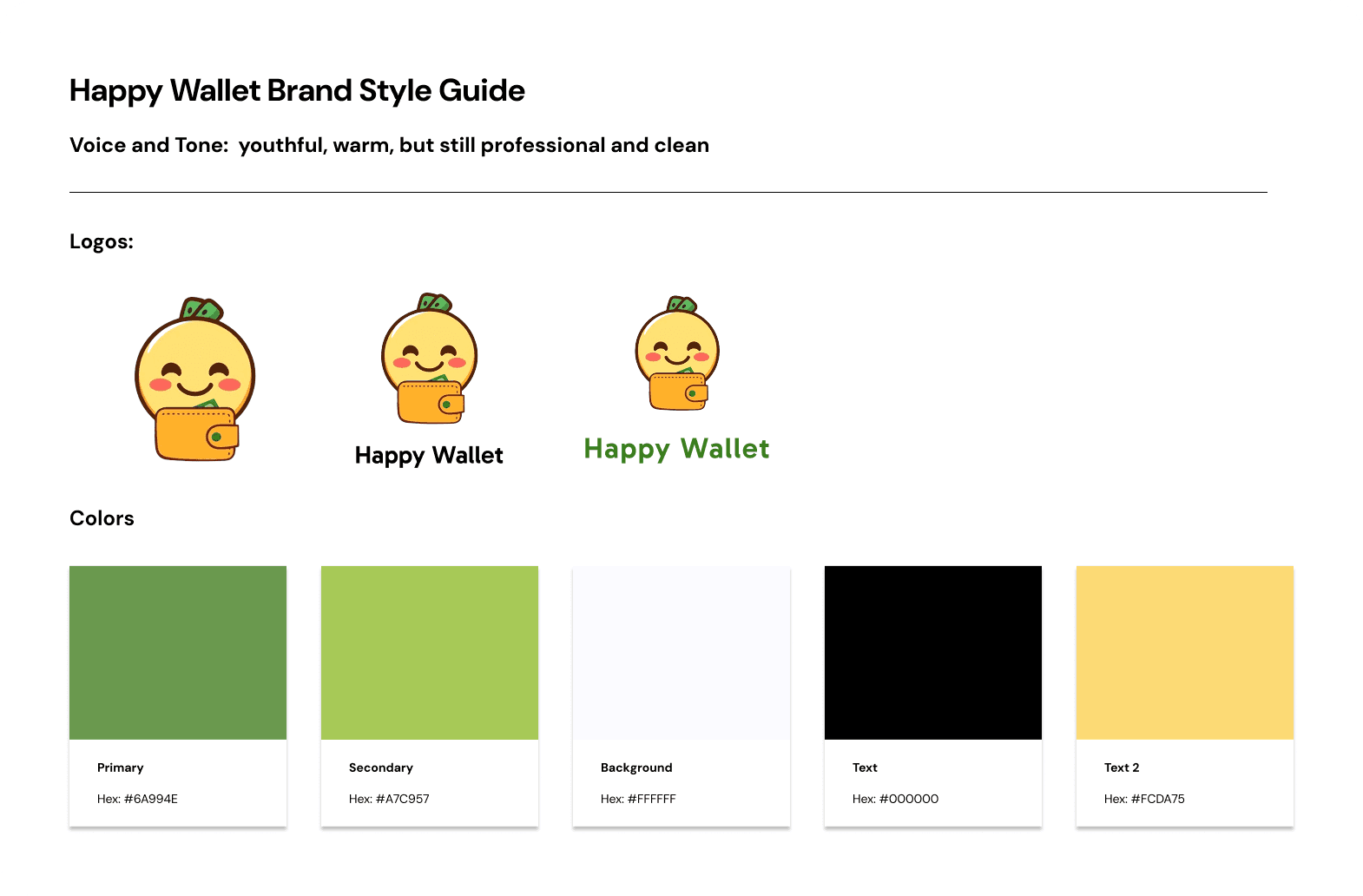
Style Guide

Usability Testing
We tested our high-fidelity prototype with 9 users to identify areas for improvement and we iterated on those suggestions, which were:


Course page was overcrowded with large blocks of text and lacked a clear textual hierarchy.
“It feels like there’s so much to look into. Even looking into one thing can turn into a whole rabbit hole of information.”
-Interviewee #3
We added separate pages, clear instructions, more modularity, and an understandable hierarchy.
It’s not apparent from the home page that there are more than just courses in the app, like the avatar and goals features.
We added easier navigation that reflects the rest of the app’s features, including the avatar, daily streak, daily challenge, and goals.


Many users thought the app was a game and did not view it as an educational app.
We changed the font to be more sophisticated to emphasize the educational aspect of the app and increase professionalism.
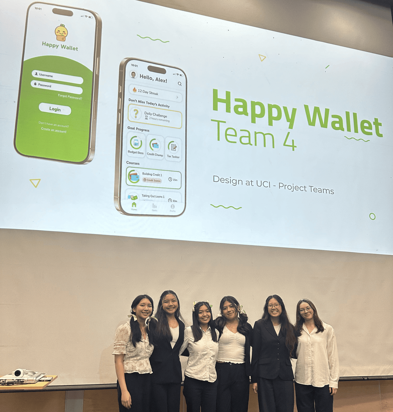
Final Demo
Reflection
This project reinforced the value of continuous user feedback and the power of simplicity. Every decision, from content hierarchy to color choice, was informed by actual user needs.
Lessons Learned:
Always start with user research
Iteration sharpens clarity and impact
Simplicity + focus over flashy features
Thank You!